Cover Art Showcase 1
Hello, and welcome back to The Hinterlands. I have a longer piece about Damon Knight’s Orbit anthologies that I’ve been working on but it needs a little more time in the oven, so I’m breaking out a new regular feature that I will deploy whenever I need a low effort blog post to fill a slot. It’s a roundup of some of my favourite book covers from my always growing collection of Speculative Fiction novels and short fiction collections. Let’s get to it.
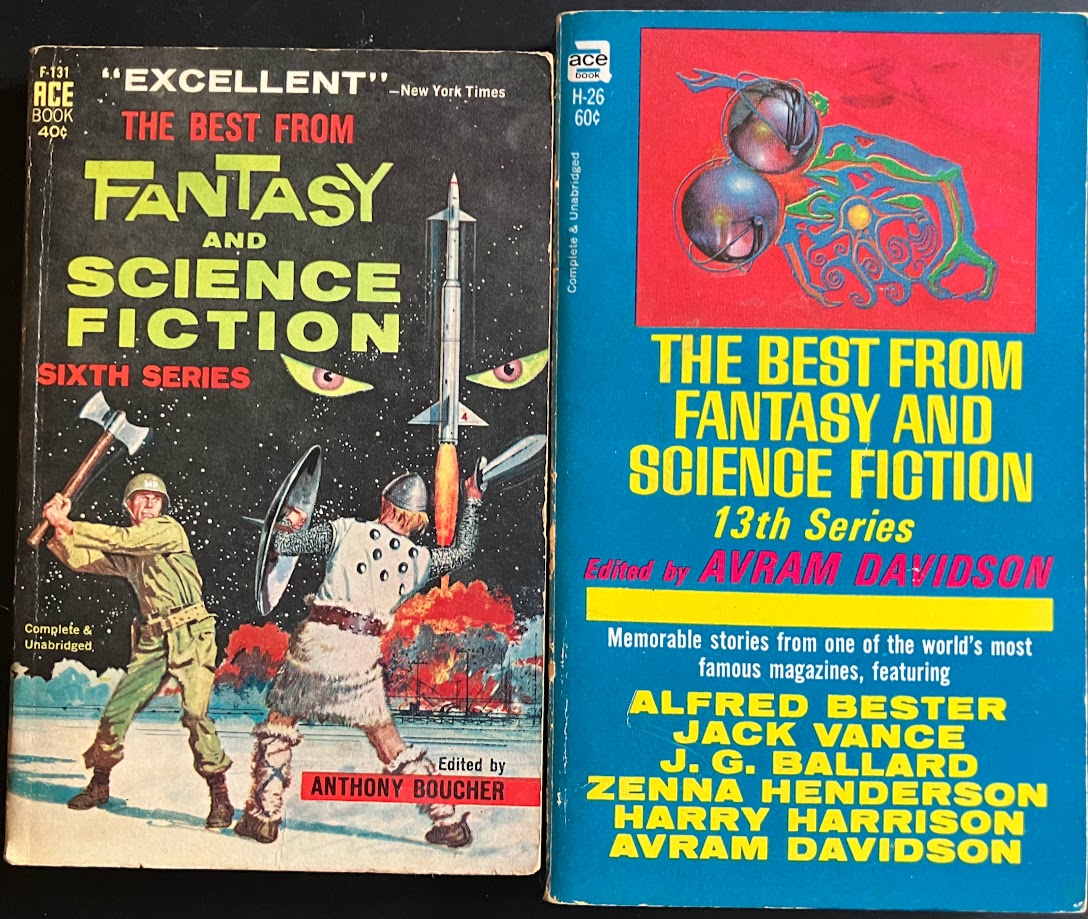
The Best From Fantasy and Science Fiction
Sixth Series Cover by Ed Valigursky 13th Series Cover probably by Jack GaughanIn my year of diving ever deeper into the ecosystem of SF/F sections at used book stores across Eastern Ontario I have come to truly love the short fiction anthology, and part of that love is getting to know the vast number of different types that existed over the last 75+ years. Pictured are two volumes in the Best from (The Magazine of) Fantasy and Science Fiction series. Series Six was originally published in 1957 (though this paperback is from 1962), and series 13 was originally published in 1964 (this paperback edition published in 1967). As you can probably tell, there was a shift in tone that occurred between the 1950s and the 1960s at The Magazine of Fantasy and Science Fiction, and the covers and branding reflect that.
I love both of these covers! The pulp goofiness of the GI fighting the viking (on the moon?) with a rocket blasting off and menacing eyes appearing in the starscape background is a really striking and dynamic design with a lot going on without being too busy. I would replace 95% of book store cover art with this image in a heartbeat. The 13th series art is also great, the abstract art boxed off at the top and a bold yellow text against a blue background is really striking. It’s as much about the overall graphic design as it is the art, which is a theme I suspect we’ll see more of throughout this series. The flash of red for Avram Davidson’s name is a great touch as well. Lovely stuff.
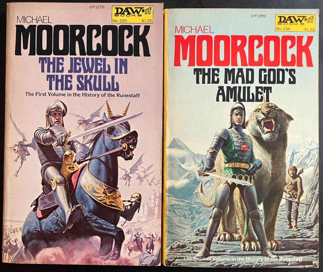
Moorcock DAWs
Both by Richard Clifton-DeyHey! It’s Michael Moorcock’s The Jewel in the Skull and The Mad God’s Amulet, two quarters of The History of the Runestaff, a series I inducted into The Hinterlands Canon back in Hinterlands #1! I read both of these originally as ebooks, but when I came across pristine DAW yellow spine editions with this gorgeous art on them I had to pick them up. There are a number of different publisher series from this era with striking and memorable graphic design that have become collectible today – I expect to discuss Timescape and Ballantine Adult Fantasy as well later on in this series. Unlike those other two examples, I don’t buy every DAW I come across (although I often think about it). There are just too many of them to buy them indiscriminately, and the fact that some real awful shit like the Gor series was published under the label means I wouldn’t even want a complete set even if money and time were no obstacle.
That said, when it comes to Moorcock, the DAW editions of his books often have the best covers, and sometimes they command a steep price even in physical stores, let alone online. I came across a DAW edition of Elric of Melnibone in good condition asking $50 at a local used place that doesn’t usually price things that aggressively. But, they knew what they had, and it was gone the next time I came in. Hard for me to imagine paying $50 for a paperback, but those DAW Elrics are precious.
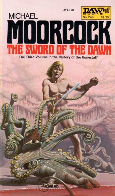
I cannot for the life of me remember what scene in the book this is depicting, if any. In the third book they end up in a weird apocalypse world where spherical aliens hunt people that live in bunkers for a bit? But I don't remember Hawkmoon fighting octopus lizards while nude. Unbelievably sick cover.
Side note, my copies of volumes 3 and 4 are not the DAW editions (alas) and I’d never looked at the DAW for The Sword of the Dawn before. That is the greatest cover I’ve ever seen. Insta-buy if I come across it on a shelf.
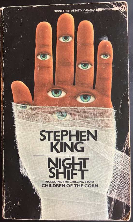
Stephen King’s Night Shift
Cover by Don BrautigamI have become a bit of a freak for buying multiple copies of books lately. In general this practice is reserved for my all time favourites, of which I will happily pick up a new edition if I see a cover I like (and don’t already own) for a reasonable price. This isn’t what happened with this book, as I still haven’t read King’s Night Shift (although I am at this point a Stephen King Appreciator). This cover is just so good. King’s early covers are generally strong, but this one is one of my favourite book covers of all time. It’s so freaky.
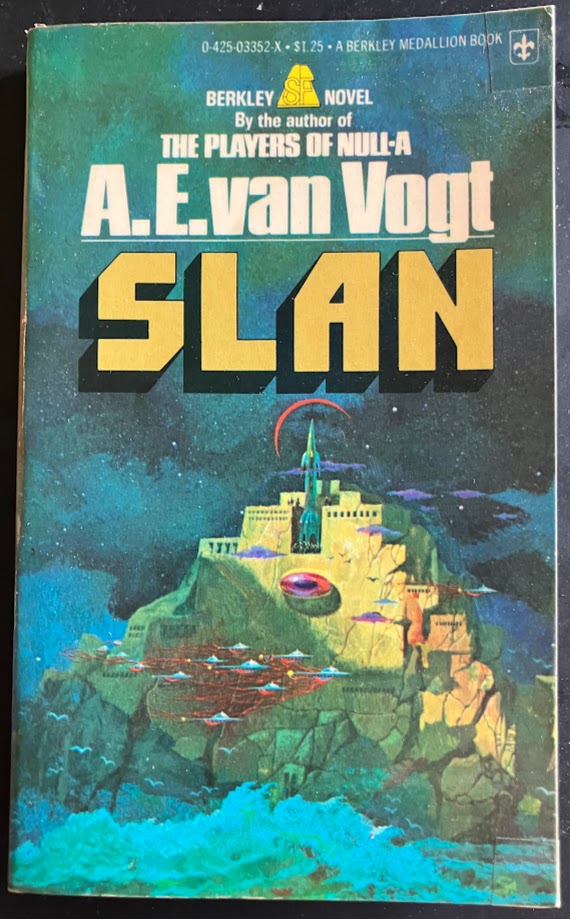
A.E. van Vogt's Slan
Cover by Paul LehrI picked this up in the last week or so. I’d been looking for a copy of Slan for ages, and I’ve had a few opportunities but usually they’ve been a more recent TPB edition for >$10 which is a bit steep for an author I’m still not super familiar with. This though, this edition is gorgeous. I don’t pay a ton of attention to artists despite my love of vintage SF cover art, and that’s something I want to change. Paul Lehr is a name that was etched in my brain even before I looked it up, because when I saw this cover of Slan I knew immediately that it was done by the same artist who did a cover I’m obsessed with, this cover for Asimov’s The End of Eternity.

I have been obsessed with this cover from the first time I saw it. I just love large geometry in space I guess.
It has that same sense of enormous geometric scale, vast open space – I love it so much. I’m desperate for a copy of this edition of End of Eternity, which I’ve still never seen in real life. A quick search through Lehr’s work on isfdb reveals him as the cover artist for the paperback editions of Damon Knight’s Orbit series (aha!) which I also love.


His colours are so rich and deep, it feels like you could sink into them. I love it. He also did this cover of Solaris, which is another favourite of mine, and another book I would buy a second copy of in a heartbeat if that cover was available.
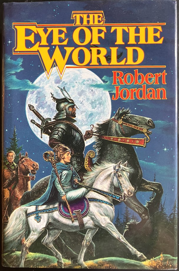
The Eye of the World by Robert Jordan
Cover by Darrell SweetThe covers of the Wheel of Time series are THE reason I read these books as a young teen. They’re iconic, especially this first one, some of the best fantasy art of their type. What’s fascinating to me is going back and looking at Darrell Sweet’s novel covers prior to Wheel of Time. While he’s certainly not a bad artist, and has done lots of covers I have in my collection like the original paperback edition of Lord Foul’s Bane, the stuff he’s doing for Wheel of Time feels distinct from everything that came before, much more in the vein of Michael Whelan’s fantasy realism.
Have a favourite speculative fiction book cover? Share it in the comments below, or send it to the hinterlands mailbox (thehinterlandsblog@gmail.com)!
Links and Recommendations:
- The Robber Time: Joanna Russ in the Archives: Loved this piece from Cameron Kunzelman about his time with the Joanna Russ papers. I'd been listening enviously to him talk about his experiences on the Shelved by Genre podcast, so it was nice to be able to read a more in-depth piece. As someone who's been reading Russ, Tiptree, and Delany this year it felt like a great supplement to that.
Hinterlands Annual #1 is available here.
Still working on the next youtube video - someday I will figure out how to get these out consistently. The last one is still here if you haven't seen it yet.
Okay bye!